library(ggplot2)
library(patchwork)
library(openintro)Confidence Intervals
Required Packages
theme_set(theme_bw())
theme_replace(panel.grid.minor = element_blank(),
              panel.grid.major = element_blank())
Confidence intervals provide a range of values that indicates the level of uncertainty associated with an estimate. This helps us understand the precision of the estimate, as apposed to a point estimate.
Show Code
generate_CI <- function(sample_size,n_samples,
                        population_size=1000,
                        critical_value = 1.96){

  population <- rnorm(population_size)
  sample_means <- replicate(n_samples, mean(sample(population,sample_size)))

  lower <- sample_means - critical_value * sd(population)/sqrt(sample_size)
  upper <- sample_means + critical_value * sd(population)/sqrt(sample_size)

  trial <- 1:n_samples
  cover <- (mean(population) >= lower) & (mean(population) <= upper)
  CIs <- data.frame(sample = trial, lower, upper, cover, n_samples)

  plt <- ggplot(CIs, aes(y = trial)) +
    geom_segment(aes(x=lower, y=trial, xend=upper, yend=trial, color= cover),
                 show.legend=FALSE) +
    scale_color_manual(values=c('#bf0202','#ccecf0'))+
    annotate("segment", x=mean(population), xend=mean(population),
             y=0, yend=length(trial)+1, color="black",
             linewidth = 1,linetype =2) +
    labs(x=expression(bar(x)), y = "Iteration",
         title = paste0(100*mean(CIs$cover),'% ','coverage'))

  return(plt+facet_grid(~n_samples))
}
set.seed(90)
plt <- generate_CI(sample_size = 25, n_samples = 100)
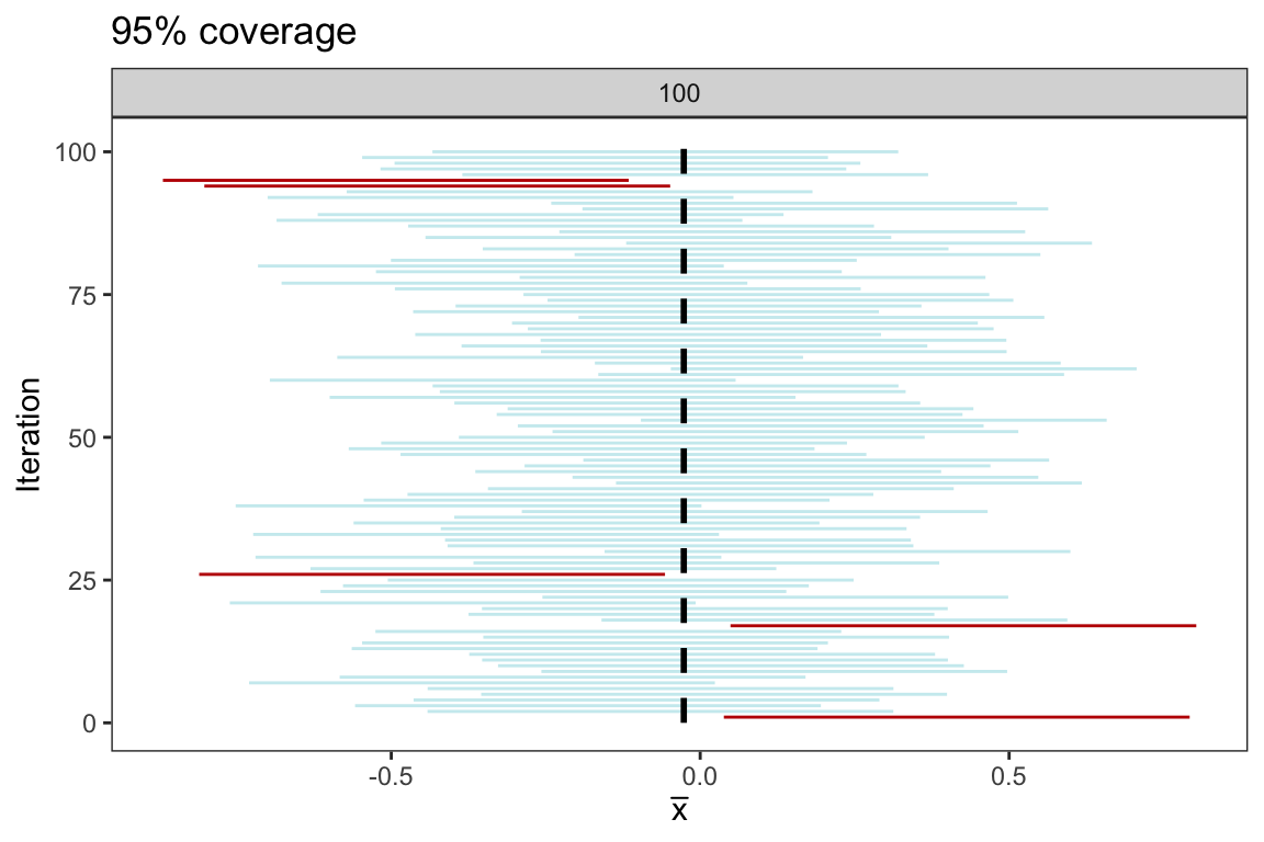
From the plot above, we see that 95 of the 100 confidence intervals cover the population parameter \(\mu = 0\). While it’s important to note that if we were to repeat the simulation another 100 times, the precise count may vary, but it is highly probable that it will remain close to 95
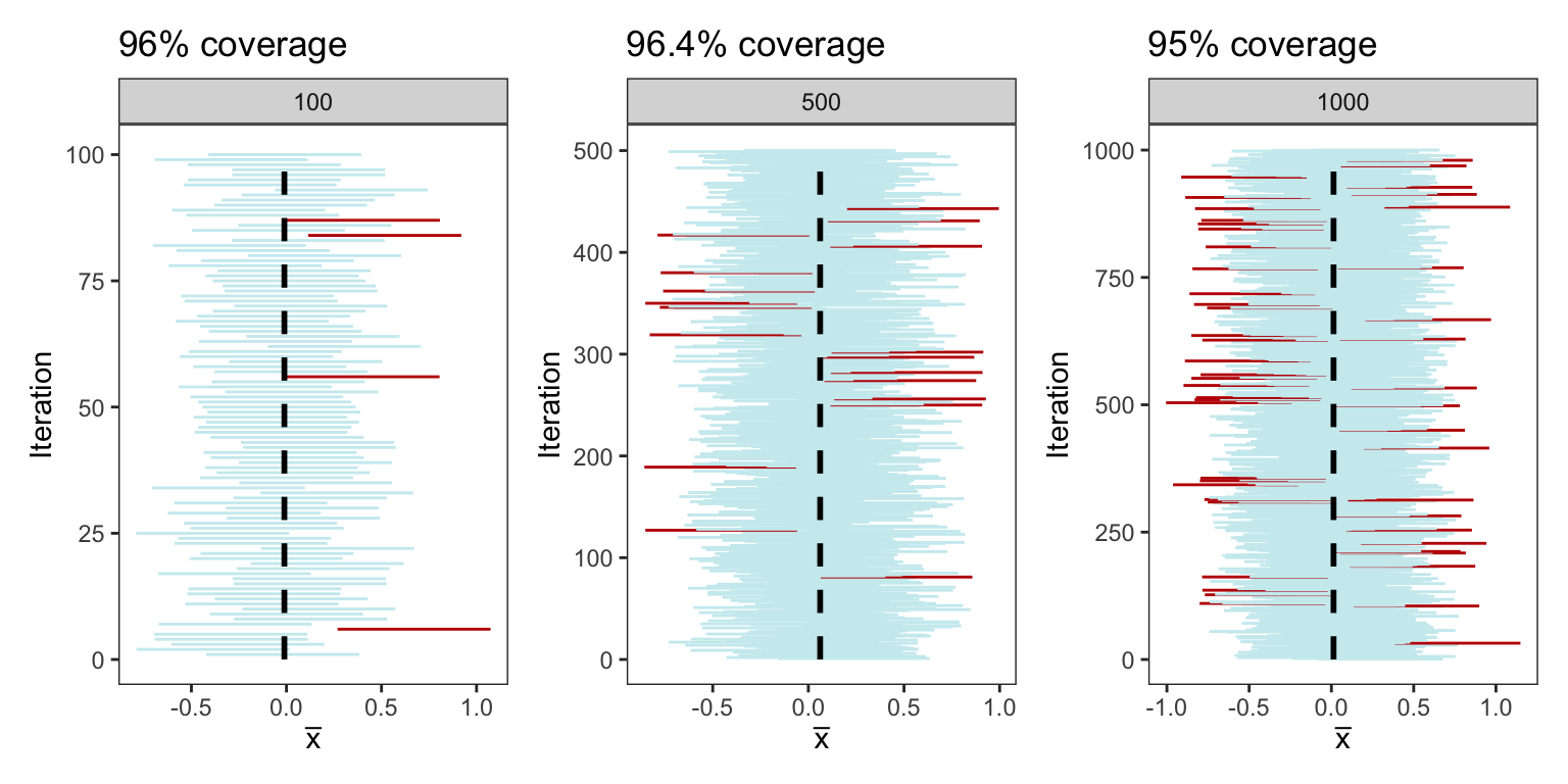
In the below plots, we repeat the same process mentioned above but this time constructing intervals from 100, 500, and 1000 samples each of size 25. The coverage percentage is demonstrated in the title of each respective plot
Show Code
plots <- generate_CI(sample_size = 25, n_samples = 100)+
  generate_CI(sample_size = 25, n_samples = 500)+
  generate_CI(sample_size = 25, n_samples = 1000)+
  plot_layout(ncol=3)
Inference for a Population Mean
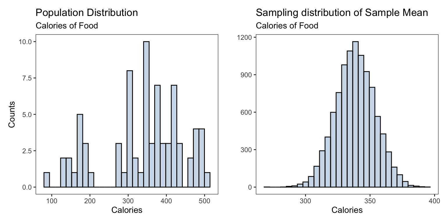
We consider the Starbucks data set from the package openintro. This data gives nutrition facts for several food items at Starbucks, we are primarily interested in the average calories in the their food items.
starbucks <- openintro::starbucks#> # A tibble: 6 × 7
#> item calories fat carb fiber protein type
#> <chr> <int> <dbl> <int> <int> <int> <fct>
#> 1 8-Grain Roll 350 8 67 5 10 bakery
#> 2 Apple Bran Muffin 350 9 64 7 6 bakery
#> 3 Apple Fritter 420 20 59 0 5 bakery
#> 4 Banana Nut Loaf 490 19 75 4 7 bakery
#> 5 Birthday Cake Mini Doughnut 130 6 17 0 0 bakery
#> 6 Blueberry Oat Bar 370 14 47 5 6 bakeryWe create the sampling distribution for the sample proportion of tenured professors and compare it to the population distribution of all the professors ranks
n_samples <- 10000
sample_size <- 30
calories <- starbucks$calories
sample_calories <- numeric(n_samples)

for(i in 1:n_samples){
  sample_i =  sample(calories, size = sample_size) # generate a new sample from the population
  sample_calories[i] = mean(sample_i) # obtain proportion for each sample
}
Show Code
pop_plt <- ggplot(starbucks) +
 geom_histogram(mapping = aes(x = calories), bins = 30,
          fill='steelblue',alpha = 0.3,color='black')+
  labs(title = 'Population Distribution',
       subtitle= "Calories of Food",
       y = 'Counts', x = 'Calories')
sampling_dist <- ggplot(data.frame(sample_calories),
aes(sample_calories))+
geom_histogram(fill = 'steelblue',alpha = 0.3,bins = 30,
color = 'black')+
labs(title = 'Sampling distribution of Sample Mean',
subtitle = "Calories of Food",
x = 'Calories',y = '')
| Population | Sampling | |
|---|---|---|
| Shape | skewed | normal/bell-shaped |
| Mean | 338.8311688 | 338.6314 |
| SD | \(\sigma =\) 105.3687014 | \(\frac{\sigma}{\sqrt{n}} =\) 19.2376049 |
When the sampling distribution is roughly normal in shape, then we can construct an interval that expresses exactly how much sampling variability there is. Using our single sample of data and the properties of the normal distribution, we can be 95% confident that the population parameter is within the following interval \[ \left[\overline{x} - ME \, \, , \, \,\overline{x} + 1.96 ME \right] \]
where the margin of error \(ME = \text{critical value} \times SE\). The critical value for a \(100(1-\alpha\))% CI can be obtained by qnorm(p = 1-alpha/2) whenever the sample size is large enough, say \(n=30\) and the sampling distribution is approximately normal (bell-shaped)
For example, a 90% = 100(1-0.1)% CI can be calculated as
alpha = 0.1
qnorm(p = 1-alpha/2)
#> [1] 1.644854Commonly used critical values are
| Confidence Level | Critical Value | R code |
|---|---|---|
| 99% | 2.58 | qnorm(p = 1-0.01/2) |
| 95% | 1.96 | qnorm(p = 1-0.05/2) |
| 90% | 1.65 | qnorm(p = 1-0.1/2) |
The standard error can be approximated using \(SE = \frac{\sigma}{\sqrt{n}} \approx \frac{s}{\sqrt{n}}\), where \(s\) is the standard deviation of the sample obtained from the population
Putting all of this together, a 95% CI is \[ \left[\overline{x} - 1.96 \frac{s}{\sqrt{n}} \, \, , \, \, \overline{x} + 1.96 \frac{s}{\sqrt{n}} \right] \]
set.seed(1)
sample_calories <- sample(calories, 30)
xbar_calories <- mean(sample_calories)
sd_calories <- sd(sample_calories)
For our Starbucks calories example, A sample mean obtain from a SRS is \(\overline{x} =\) 353.333 and standard deviation \(s=\) 90.984 then the 95% CI is
lower_bound <- xbar_calories - 1.96*(sd_calories/sqrt(30))
upper_bound <- xbar_calories + 1.96*(sd_calories/sqrt(30))c(lower_bound, upper_bound)#> [1] 320.7750 385.8917We are 95% confident the population avarage for calories of food at Starbucks is between 320.775 and 385.892
Inference for a Population Proportion
We consider the Professor evaluations and beauty data from the package openintro. This data was gathered from end of semester student evaluations for 463 courses taught by a sample of 94 professors from the University of Texas at Austin. In addition, six students rate the professors’ physical appearance. The result is a data frame where each row contains a different course and each column has information on the course and the professor who taught that course
professor_evaluations <- openintro::evals#> # A tibble: 6 × 23
#> course_id prof_id score rank ethnicity gender language age cls_perc_eval
#> <int> <int> <dbl> <fct> <fct> <fct> <fct> <int> <dbl>
#> 1 1 1 4.7 tenure … minority female english 36 55.8
#> 2 2 1 4.1 tenure … minority female english 36 68.8
#> 3 3 1 3.9 tenure … minority female english 36 60.8
#> 4 4 1 4.8 tenure … minority female english 36 62.6
#> 5 5 2 4.6 tenured not mino… male english 59 85
#> 6 6 2 4.3 tenured not mino… male english 59 87.5
#> # ℹ 14 more variables: cls_did_eval <int>, cls_students <int>, cls_level <fct>,
#> # cls_profs <fct>, cls_credits <fct>, bty_f1lower <int>, bty_f1upper <int>,
#> # bty_f2upper <int>, bty_m1lower <int>, bty_m1upper <int>, bty_m2upper <int>,
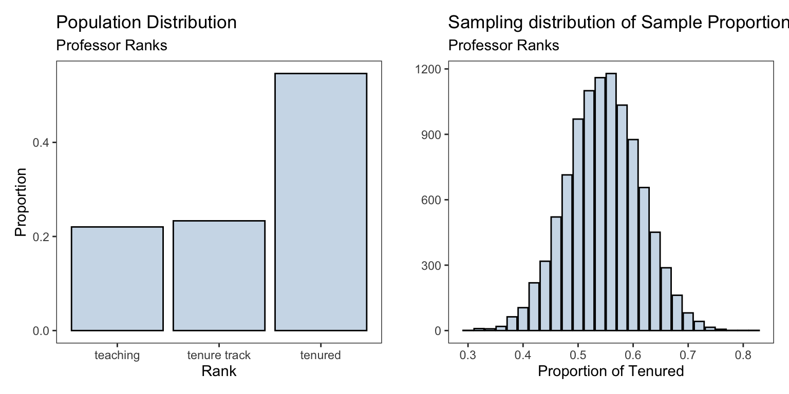
#> # bty_avg <dbl>, pic_outfit <fct>, pic_color <fct>We are interested in the proportion of professors who are of rank “Tenured”. The proportions of the professors ranks are shown below
table(professor_evaluations$rank) |>
  prop.table()
#>
#> teaching tenure track tenured
#> 0.2203024 0.2332613 0.5464363We create the sampling distribution for the sample proportion of tenured professors and compare it to the population distribution of all the professors ranks
n_samples <- 10000
sample_size <- 50
rank_proportions <- numeric(n_samples)

for(i in 1:n_samples){
  sample_i =  sample(professor_evaluations$rank, size = sample_size) # generate a new sample from the population
  rank_proportions[i] = mean(sample_i == 'tenured') # obtain proportion for each sample
}
Show Code
sampling_dist <- ggplot(data.frame(rank_proportions),
                        aes(rank_proportions))+
  geom_bar(fill = 'steelblue',alpha = 0.3,
                 color = 'black')+
  labs(title = 'Sampling distribution of Sample Proportion',
       subtitle = "Professor Ranks",
       x = 'Proportion of Tenured',y = '')
pop_plt <- ggplot(professor_evaluations) +
geom_bar(mapping = aes(x = rank, y = ..prop.., group = 1), stat = "count",
fill='steelblue',alpha = 0.3,color='black')+
labs(title = 'Population Distribution',
subtitle= "Professor Ranks",
y = 'Proportion', x = 'Rank')
| Population | Sampling | |
|---|---|---|
| Shape | normal/bell-shaped | |
| Mean | \(p=\) 0.5464363 | \(\hat{p}=\) 0.546252 |
| SD | \(\sigma = \sqrt{p(1-p)} =\) 0.497839 | \(\sqrt{\frac{p(1-p)}{n}} =\) 0.0704075 |
We can form a 95% confidence interval for the population proportion of professors who are tenured rank at the University of Texas at Austin \[ \left( \hat{p} - \, 1.96 \sqrt{\frac{\hat{p}(1-\hat{p})}{n}} \, \, , \quad \hat{p}+ \, 1.96 \sqrt{\frac{\hat{p}(1-\hat{p})}{n}} \right) \]
Giving us the following 95% CI (0.408,0.684). We can see the constructed interval contains the population proportion of 0.5464363. A simple interpretation of this confidence interval is
We are 95% confident that the population proportion of tenured professors at the University of Texas is between 0.408 and 0.684